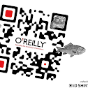
Don't let your QR codes be boring!
Great find by +Claude Rieth
#forwidersharing #designtips #hintsntips
Great find by +Claude Rieth
#forwidersharing #designtips #hintsntips
Claude Rieth originally shared:
( #crThu:01) Beautiful Error Correction: Artsy QR Codes!
Having recently seen some of these nicely designed & enhanced QR codes, I was fascinated and intrigued, so I started googling around a little bit...
It seems that there are agencies specialising in creating these, and there are several websites which will give you the possibility to create & enhance some of your own! Of course you could also paint one with a brush and some colors...
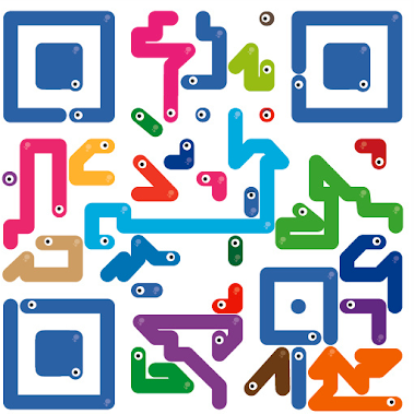
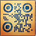
Please find some examples of well enhanced codes in the album below.
QR Code — abbreviated from Quick Response Code — is the trademark for a type of matrix barcode (or two-dimensional code) first designed for the automotive industry.
Thanks to error correction, it is possible to create artistic QR Codes that still scan correctly, but contain intentional errors to make them more readable or attractive to the human eye, as well as to incorporate colors, logos and other features into the QR Code block. (wikipedia)
tl;dr:Bleep. Bleep. Biiiip.
Websites:
http://www.qrhacker.com/
http://mashable.com/2011/04/18/qr-code-design-tips/
http://www.flickr.com/groups/qr-art/pool/





No comments:
Post a Comment
Comment moderation is switched on. Please wait till I've had a chance to review your comment and publish it. Thanks!